Female Abstract Artists: If You Want To Change the Product, Change the Process – And If You Want To Change the Story, Change the Narrator

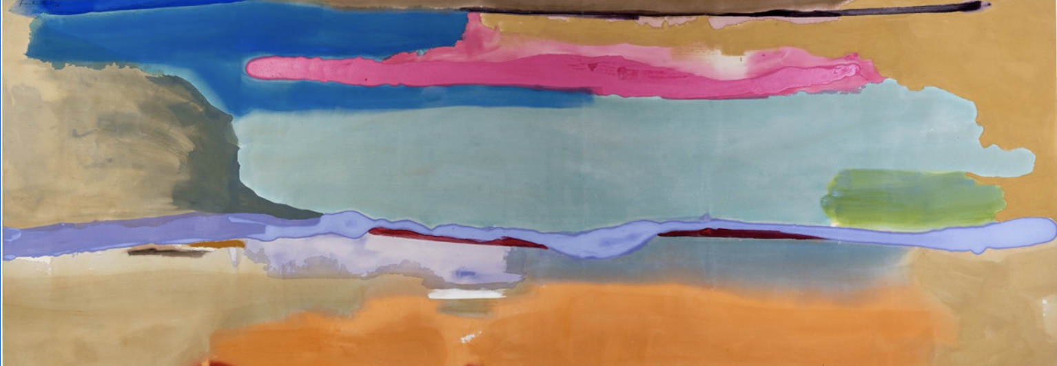
Helen Frankenthaler, April Mood, 1974 © 2023 Helen Frankenthaler Foundation, Inc./Artists Rights Society (ARS), New York. Photo: courtesy ASOM Collection

I recently attended an excellent exhibition of the work of women abstract painters from the 1940s to the early 1970s. (‘Action, Gesture, Paint’ is at the Whitechapel Gallery, London until 7 May.)

On entering the gallery, you’re greeted by Helen Frankenthaler’s ‘April Mood’, a joyous choreography of colour: royal and pale blue, purple and radiant pink, set against a base of sandstone and tangerine.

‘A really good picture looks as if it’s happened at once. It’s an immediate image.’
Helen Frankenthaler

There follows a selection of work by some 80 artists from all over the world. Big, bold, vibrant canvases. Audacious expressions of raw experience: joy, awe, anger and despair. Emotional responses to a world in crisis and to the beauties of nature.

'I paint from remembered landscapes that I carry with me - and remembered feelings of them, which of course become transformed.’
Joan Mitchell

These artists were liberated from the constraints of tradition and convention. As Ida Barbarigo declared, they wanted to ‘unlearn painting,’ to forget academic teaching.

I was particularly struck by the inventiveness of their working methods.

Some layered the paint on thick. Some scraped it and scratched it. Others spattered, splashed and sprayed; and liberally added dribbles and stains. Their gestures were occasionally spontaneous and occasionally controlled. Some mixed their paint with other materials: sand, sawdust, cigarette ash and cement; lacquer, chalk and carpenter’s glue. 
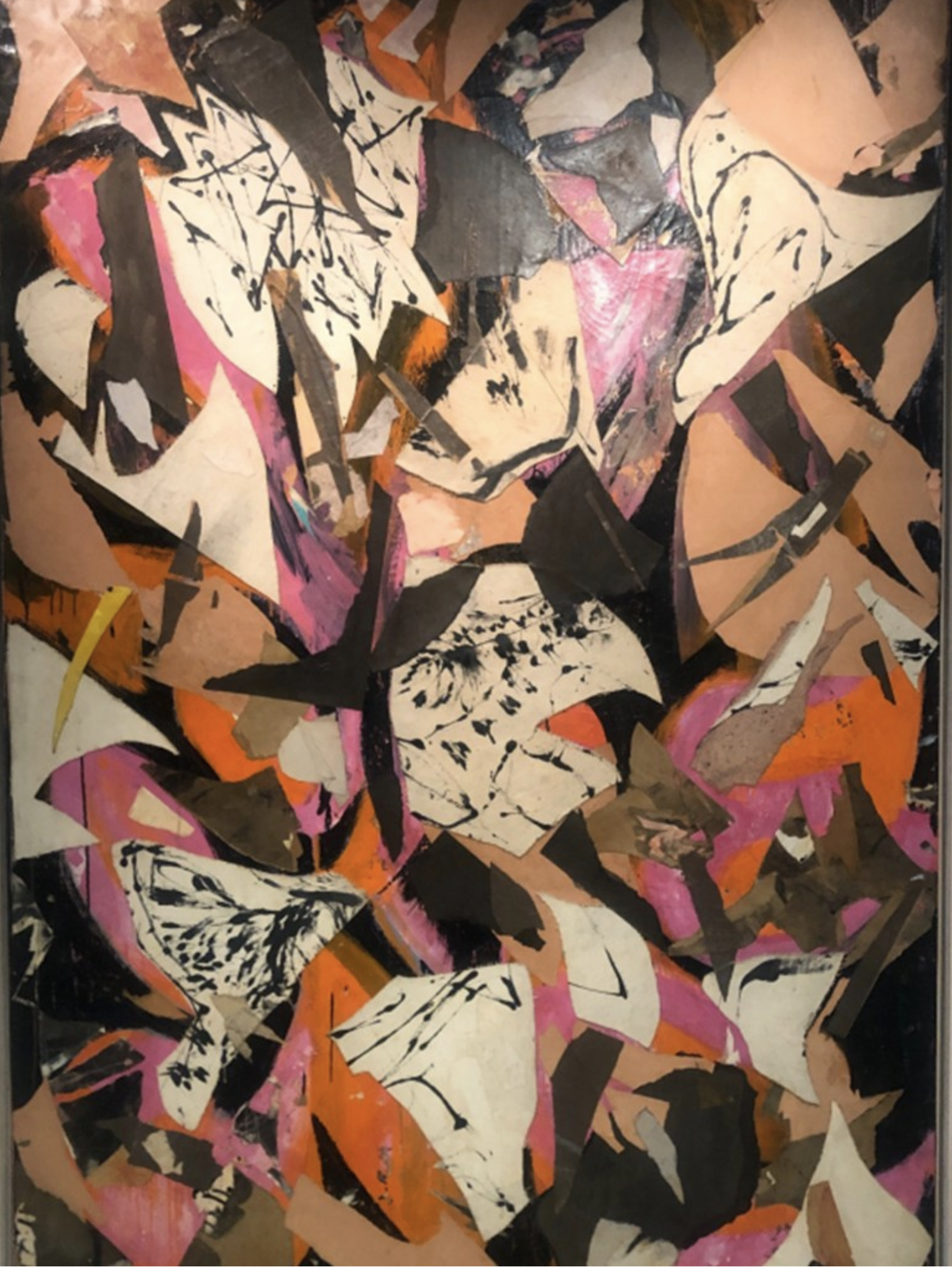
Work, 1958-62by Yuki Katsura. Image: Courtesy Alice and Tom Tisch, New York © Estate of Yuki Katsura

‘My paintings are collaged bits of time from my past and present experiences.’
Wook-kyung Choi

Frankenthaler achieved her fluid, organic effects by thinning her paint and applying it to unprimed canvas. Gillian Ayres worked at speed, pouring paint straight from the can, or squirting it directly from the tube. Lee Krasner integrated into her work cut-up fragments of newspapers, burlap and discarded drawings. Yuki Katsura placed wet washi paper on painted canvas and then overpainted it. Franciszka Themerson tilted her paper so that the enamel flowed in loose, curving calligraphic forms. Janet Sobel trickled pigment from a pipette (well before Jackson Pollock adopted his celebrated ‘drip technique’). 

The exhibition repeatedly confirms a truth that pertains to any creative endeavour: if you want to change the product, change the process.

‘To me, art - colour in art – is wonderfully indulging… I don’t see why you shouldn’t be filling yourself up, making yourself happy. Enjoying yourself. Feasting on beauty. I want an art that’s going to make me feel heady, in a high flown way. I love the idea of that.’
Gillian Ayres 

Lee Krasner, Bald Eagle, 1955 (Credit: The Pollock-Krasner Foundation)

One wanders through the exhibition with a faint sense of recognition. Many of these ideas, themes and approaches are familiar to us. But, with a few exceptions, the works and the artists are not.  

The story of Abstract Expressionism, the art movement that emerged in New York in the late 1940s is classically written around titanic male figures like Jackson Pollock, Willem de Kooning and Mark Rothko. 

There were women artists on the scene, but it was a notoriously machismo culture. Corinne West painted under the name Michael West so as to disguise her gender. Elaine de Kooning signed her work with her initials to evade comparisons with her husband. Grace Hartigan became George and Lena Krasner became Lee.

'It’s quite clear I didn’t fit in. With relation to the group, if you are going to call them a group, there was not room for a woman.'
Lee Krasner 

Elaine de Kooning The Bull 1959 (1) - Whitechapel Gallery

Over time the women abstract artists were marginalised or written out of the movement’s history. Recent retrospectives have included few females.

The Whitechapel exhibition endeavours to right this wrong. Regarding the past through a different lens, it changes our perception of something we thought we knew. And in so doing it has quite an uncanny effect. It is at once both familiar and fresh. 

The show demonstrates that if you want to change the story, you should consider changing the narrator.


'… Sitting at this party,
Wondering if anyone knows me,
Really sees who I am.
Oh, it's been so long since I felt really known.
… Living in the wake of overwhelming changes,
We've all become strangers
Even to ourselves.
We just can't help,
We can't see from far away,
To know that every wave might not be the same,
But it's all apart of one big thing.
… Oh, it's not just me, it's not just me,
It's not just me,
It's everybody.’ 

Weyes Blood, 'It’s Not Just Me, It’s Everybody’ (N Mering)

No. 409

‘Maximum Meaning, Minimum Means’: Abram Games and the Craft of Poster Design

Abram Games/The Jewish Museum

'I wind the spring and the public, in looking at the poster, will have that spring released in its mind.' 
Abram Games

I recently visited a fascinating exhibition of the wartime work of graphic designer Abram Games. (‘The Art of Persuasion: Wartime Posters by Abram Games’, The National Army Museum in Chelsea, until 24 November 2019)

Abraham Gamse’s 1925 Lower 3A report was not very encouraging. He was 11 years old and had recently enrolled at Hackney Downs School. 

‘Work much too careless and untidy; lazy and indifferent.’

The report also mentioned that his drawing skills were weak. This seems a little harsh as Gamse went on to become one of the finest graphic designers of the twentieth century.

Estate of Abram Games

Estate of Abram Games

Gamse was born in Whitechapel in 1914, the son of a Jewish photographer and seamstress. His father anglicised the family name to Games in 1926. The young Games learned how to use an airbrush in his father’s photography studio. Having studied briefly at Saint Martin's School of Art, he worked for a while at a commercial design firm and attended night classes in life drawing. Soon he had established himself as a freelance poster artist. 

At the start of World War Two, Games was conscripted into the British Army, and in 1941 he was transferred to the Public Relations Department of the War Office. 

‘There is no propaganda. I conceived them as instructional and training posters. It was a job that had to be done, like cleaning the floors and keeping your rifle clean.’

Many of Games’ wartime posters addressed necessary but prosaic tasks. They warned of the safety risks relating to indiscretion and live ammunition (‘Talk kills.’ ‘Damp ruins ammunition.’). They prompted servicemen to ventilate their quarters, brush their teeth and keep their feet clean. They recruited women for the Auxiliary Territorial Service and troops for the Airborne Divisions. And they urged the public to economise, contribute money, give blood, grow their own food and knit socks for jungle fighters.

Games’ posters also sought to encourage and inspire British troops: this was a war worth fighting and there were better times ahead; clean modern schools, hospitals and housing would rise up from the rubble; you could sign on for an army education scheme to prepare for a return to civvy street. Towards the end of the war Games designed some compelling posters seeking aid for displaced Jews.

Working in a protective smock that his mother had made for him, Games combined strong silhouettes, geometric shapes, stylised illustration and photographic images. He had been inspired by the Surrealist movement, and he magically turned a ship’s hull into a shovel, a mosquito into a death mask, the Houses of Parliament into a hand poised over a ballot paper (‘Serve as a soldier, vote as a citizen.’). A master of the airbrush, he tended to use just four bold colours. He reduced verbal messaging to a minimum, integrating succinct, authoritative type with his eye-catching imagery. 

‘I am not an artist, I am a graphic thinker.’

Games’ posters elegantly illustrated cause and effect, before and after, risk and reward. Sometimes they simply celebrated an aspiration or stated the raw facts. Often they used humour. He was clearly passionate about his chosen medium and his work provided a master class in poster communication. 

‘They are after all but printed paper, transient and impermanent. But if they convey to you the message I have been asked to transmit, they may succeed in living a while longer in your minds, and surely that is the job of the poster. If they do that then I shall be deeply satisfied.’

Games recognised that the craft of poster design is all about sacrifice and reduction, concentration and precision. It requires that you compress, condense and clarify. He would first produce an image in thumbnail to test whether his idea could communicate at distance. His motto was ‘Maximum Meaning, Minimum Means.’

‘To get it down to its simplicity, so that it talked from 50 yards, that was the difficulty.’

Screenshot 2019-06-05 at 17.34.24.png

Games also understood that successful poster communication requires imagination as much as distillation.

‘An idea has to be implanted in the audience, but it has to be implanted imaginatively, in such a way as to fire the interest and kindle a response to new thinking.’

Critically, he believed that you need to earn people’s immediate attention and enduring recollection. Great posters must involve the viewer.

‘I want to involve the mind as well as the eye of the viewer in my work. I want them to think, because what they are seeing is intriguing. Once you can get them to look at it, that’s fine, they are co-operating and the design is doing its job.’

Having served as an infantry private, Games was keen to bring colour and vibrancy to the barrack room’s creosote-covered brown wooden walls. As a committed socialist, he believed that posters had a civic function. 

‘The hoarding is ‘the art gallery of the man in the street.’ Posters should be selected like pictures in a gallery.’

After the war Games worked for commercial clients like Shell, the FT, Guinness, British Airways and London Transport. As well as posters, he designed stamps, book jackets and logos, including the emblem for the 1951 Festival of Britain. He died in 1996. 

It seems to me that Games’ principles are as relevant today as they ever were. He teaches us to think hard about the mechanics of the medium we’re employing; to be clear and concise, so that the message can be understood at distance and at speed; and to be insightful and imaginative, so that viewers are inclined to digest and retain that message.

Most of all I was struck by Games’ social conscience. So often nowadays communication pollutes the environment. He demonstrates that it can enrich it.

No. 234